File:pie graph by era.PNG
From Homestar Runner Wiki

No higher resolution available.
pie_graph_by_era.PNG (575 × 525 pixels, file size: 4 KB, MIME type: image/png)
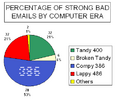
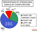
Strong Bad Email Percentage (Count) by Computer Era - For use on Strong Bad Email Statistics
Created by The Paper with helpful data from DMurphy using MS Excel and MS Paint.
  
| This image is licensed under the Creative Commons Attribution NonCommercial ShareAlike 2.0 License. |
File history
Click on a date/time to view the file as it appeared at that time.
(Latest | Earliest) View (newer 50) (older 50) (20 | 50 | 100 | 250 | 500)| Date/Time | Thumbnail | Dimensions | User | Comment | |
|---|---|---|---|---|---|
| current | 21:55, 24 February 2008 |  | 575×525 (4 KB) | ACupOfCoffee (Talk | contribs) | (Updated to email 190. I wasn't sure how to treat retirement, so I switched back to counting emails by era.) |
| 17:15, 4 November 2007 |  | 771×443 (19 KB) | SamFisher1022 (Talk | contribs) | (Updated to email 182 (this chart only counts the number of emails checked per computer, not emails checked per era)) | |
| 02:55, 10 April 2007 |  | 683×412 (43 KB) | Lapper (Talk | contribs) | (Updated to 169) | |
| 02:38, 23 April 2006 |  | 450×380 (17 KB) | ACupOfCoffee (Talk | contribs) | (updated to email 150) | |
| 20:57, 19 August 2005 |  | 403×340 (15 KB) | The Paper (Talk | contribs) | (Update based on newer set of data (Strong Bad Emails 127 - 135)) | |
| 11:01, 27 March 2005 |  | 384×310 (14 KB) | The Paper (Talk | contribs) | (graph title corrected to show "percenage") |
- Edit this file using an external application (See the setup instructions for more information)
File links
The following page links to this file:
