Talk:Strong Bad Evolution
From Homestar Runner Wiki
Contents |
Note from Character Evolution
Its being started by Piscez, but anyone can help. The format I'm using is high quality jpgs, 250 pixels tall (variable width) and cropped tightly around the character. Individual images for each version of the character, so they can be shuffled around on this page as it grows.
- Okay, maybe 250 pixels is too large, but lemme get the page all formated and I can change that later.
Looking good, pnihill2000. - [[User:Drhaggis|Dr Haggis]] 19:46, 26 Nov 2004 (MST)
Yo. What happened to the Yello Dello version of Strong Bad? -Miss Free Country USA
It escaped. Into the mountains. -Poopsmith Z
- We decided that those didn't count as evolution, since they were obviously done in a different style on purpose. Homestar Coder
 18:46, 15 Jul 2005 (UTC)
Horrible images/request for improvement
What's up with all the externally-linked-to JPGs? They look horrible and certainly don't follow the standards. And most of the other character evolution pages follow this same poor trend, like Homestar Runner Evolution. Those JPG artifacts give me the jibblies. Anyone up for some better screenshot taking? -- Tom 18:08, 12 Dec 2004 (MST)
- I'm on it. But I'll have to thumbnail some of these images. Is 150 pixels a good size? --Upsilon
- This size of the images you upload really doesn't matter. They'll be thumbnailed by MediaWiki when they are on the page. This really helps even the table out too. See Halloween Costumes and Floppy Disk Container for examples. -- Tom 13:46, 18 Dec 2004 (MST)
Didn't Strong Bad get changed again slightly at montage?
Yes, I noticed that too. His face design did change slightly in that email.
Look: 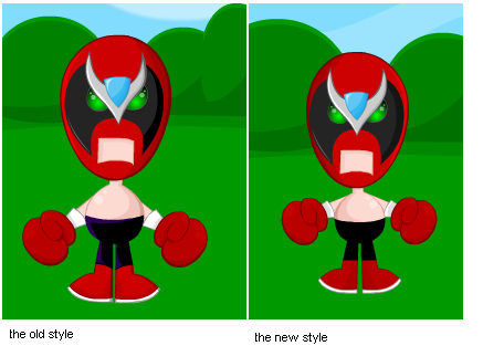
I can exactly pinpoint what's different, but somethin's different. -Princess of StrongBadia
- In the right picture, the head is slightly smaller, the eyes are a little 'dimmer', and his pants are shaded differently. These are BOTH uesd in emails these days. He looks both ways in dreamail and in origins. His pants sometimes lose their purple shading and look pure black. So far, in every email after death metal his pants had the purple hue to varing intensity. It's like TBC have two models of SB and use them interchangably. —NFITC1
 talk 17:30, 6 March 2006 (UTC)
Big Mouth Strong Bad?
I was watching the Strong Bad Sings toon and one thing hit my while I was watching it. "Man, that's one big freakin' mouth!" Has anyone else noticed that The Fourth Design, especially early on, featured a mouth which was quite wide open a rest and got even bigger when opened? Current Strong Bad's mouth it s fairly small rectangle by comparison. Just a little observation. Rocketlex 06:01, 18 October 2005 (UTC)
- Never saw that. Ever. — talk Bubsty edits 16:44, 10 December 2005 (UTC)
- I have. That was a "big freakin' mouth".-Cool Tapes.exe
New Change
 yes or no? look at his arms and how lower they are.. This was pointed out by Lord-Z
Nicko9y 02:49, 7 March 2006 (UTC)
yes or no? look at his arms and how lower they are.. This was pointed out by Lord-Z
Nicko9y 02:49, 7 March 2006 (UTC)
- Lookit the boots too... They kinda go on an angle now. It's reminiscent of the previous evolution, actually. --DorianGray
So who's gonna make it?
- Abit taller.
- Bigger Gloves
- slanted boots
- More egg shaped head?
is that it? Nicko9y 04:54, 7 March 2006 (UTC)
This is just the sixth design being reused. It's nothing new. Eman
OK It's certain
Anyone spot any more changes than the ones I pointed out?
- Arms are lower, more slanted, and slightly more behind him.
- Slanted Boots
- Bigger gloves
- More egg shaped head?
- Bigger gloves
- Slanted Boots
Also I noticed some diffrences in the shading on his calves, and on the black part of his mask.
I think his mouth has an extra level of streachability, and his head bobs up when he uses it (thus making his head behavior look more like when he is at his computer.). It was first implemted in pop-up
 Nicko9y 05:26, 7 March 2006 (UTC)
- His torso/stomach shading seems to have flopped, too. --DorianGray
- I think that's just due to the different light source. --Jay (Talk) 02:57, 8 March 2006 (UTC)
- Yer right. There's new shading on his legs and on his boots. --Broccoli Kills Word.
- It's just the sixth design; with maybe (slightly) updated shading on his boots, but still very similar. This is not a new design. Eman
- Seems odd that they're using the sixth one instead of the current, though. --DorianGray
- It's just the sixth design; with maybe (slightly) updated shading on his boots, but still very similar. This is not a new design. Eman
- Yer right. There's new shading on his legs and on his boots. --Broccoli Kills Word.
- I think that's just due to the different light source. --Jay (Talk) 02:57, 8 March 2006 (UTC)
- It's not the 6, although the boots have been redesigned too look like the sixth. You can also see a little shading on the top part of the shoe, making it look slightly more 3D.
As far as I'm concerned, droopier and lower, more hidden arms; and different head behavior warrant a new update.
6 to 8 comparison.  Nicko9y 00:45, 9 March 2006 (UTC)
- I think it all depends where the light source is in the room... TheYellowDart—(t/c)
Flash cymbals... uh... symbols
In Macromedia Flash, objects can be positioned and sized relative to each other. Strong Bad is probably made out of several Flash symbols, some of which have to be repositioned for animation effects. Perhaps TBC were simply not very precise in doing this. That would explain away little details like his head becoming larger, his arms changing position, etc.
Doesn't account for the changing shading on the boots though. 216.232.210.238 08:05, 25 July 2006 (UTC)
new one, emblem shading changed
They have a new SB with different emblem shading! It also looks like the mask is darker. X66x66

- It starts in about Sbemail 150?!? and isnt in any of the main pages. X66x66

- This is proff that he is changed, this time for real! Their might be more changes, but Im not sure
on the current one, the 2 shiny spots on his body switch to the left side.
- that's just shadows, they change all the time. — Defender1031*Talk 23:36, 30 December 2008 (UTC)
Which Ween Costumes?

- This might have something to do with the fact that he's supposed to be a lamp. --
 Super Martyo boing! 23:49, 18 April 2011 (UTC)
- Martyo makes a good point, but i also noticed the new disine in A Decemberween makareel. --that guy who is Jfiles 21:34, 22 June 2011 (UTC)
It's also in Xeriuxly Forxe!!!!!!!!!!! We must add this at wunse!!!!!!!!!!!!!!!!!!!!!!
The shading on his pants
Since the seventh design, is there a standard for whether or not Strong Bad's pants have the shading? It says on the current design (which claims a purple shading), "all Strong Bad Emails starting with alternate universe", with the exception of redesign since that one is listed in the seventh design (which claims no shading). In the current design, I noticed that there are several emails in which his pants are all black, and there are several that have the purple shading. Additionally, it was recently pointed out by an anonny that in mini-golf, Keyboard Strong Bad's pants have the purple shading while Strong Bad's pants don't. Taking samples for the seventh design: in portrait, his pants have a gray shading. In modeling, the pants have some scenes with a purple shading and some scenes where they are all black. In part-time job, his pants are all black. So there might not be a standard. ![]() The Knights Who Say Ni
The Knights Who Say Ni ![]() 19:51, 10 October 2013 (UTC)
19:51, 10 October 2013 (UTC)
