User talk:It's dot com/replacement
From Homestar Runner Wiki
Feel free to comment on this page. Or go ahead make it better yourself. Be sure to keep in mind that it has to look at least decent at a screen resolution of 800×600. — It's dot com 20:37, 13 January 2007 (UTC)
- Like the idea. Though at my 1024×768 resolution, it overlaps Strong Bad's head in the email blockquote. -- Tom 20:45, 13 January 2007 (UTC)
- Hmm. I use the same resolution, and the two never come anywhere near each other. (Although it could be a browser thing, I suppose.) Anyways, I quite like the idea. It don't look half bad. --DorianGray
- I like that box! It looks great in 1280×1240, too. Will we have "Short Toon", "Game" etc. at the top of the box if it's not a sbemail? Loafing
 20:51, 13 January 2007 (UTC)
- Hmm... I need it to
{{clear}}if it's going to collide with the transcript because of the resolution, but not do so if the screen is wide enough. Any ideas? — It's dot com 21:01, 13 January 2007 (UTC)
- Hmm... I need it to
- I like that box! It looks great in 1280×1240, too. Will we have "Short Toon", "Game" etc. at the top of the box if it's not a sbemail? Loafing
- Hmm. I use the same resolution, and the two never come anywhere near each other. (Although it could be a browser thing, I suppose.) Anyways, I quite like the idea. It don't look half bad. --DorianGray
- Issue is that if you clear, there's a huge gap as the inset is so tall. As the email blockquote is based on an image, it cannot flow around the floated inset. Perhaps the font size in the inset can be reduced, or elements rearranged, to allow it to be less tall. Alternately, or not, the email blockquote can be resized to take up less lateral width. Personally, I think given the constraints we are faced with, unless you can alter the email blockquote you're screwed. - Qermaq - (T/C)
 23:57, 13 January 2007 (UTC)
- Issue is that if you clear, there's a huge gap as the inset is so tall. As the email blockquote is based on an image, it cannot flow around the floated inset. Perhaps the font size in the inset can be reduced, or elements rearranged, to allow it to be less tall. Alternately, or not, the email blockquote can be resized to take up less lateral width. Personally, I think given the constraints we are faced with, unless you can alter the email blockquote you're screwed. - Qermaq - (T/C)
Transcript width
The width of the transcript is something that has always bothered me, but it's a separate issue from the infobox. Basically, I made it much narrower because I think it's a lot easier to read that way. What do you think? — It's dot com 21:14, 13 January 2007 (UTC)
- Hates it. I much like it wide. I find it easier to read that way. The white space sears my eyeballs. --DorianGray
- {edit conflict}I don't like all the blank white space that comes as a result, even though I do kind of like the more compact look that comes with the narrower transcript. Heimstern Läufer
 21:32, 13 January 2007 (UTC)
- {edit conflict}I don't like all the blank white space that comes as a result, even though I do kind of like the more compact look that comes with the narrower transcript. Heimstern Läufer
Issue
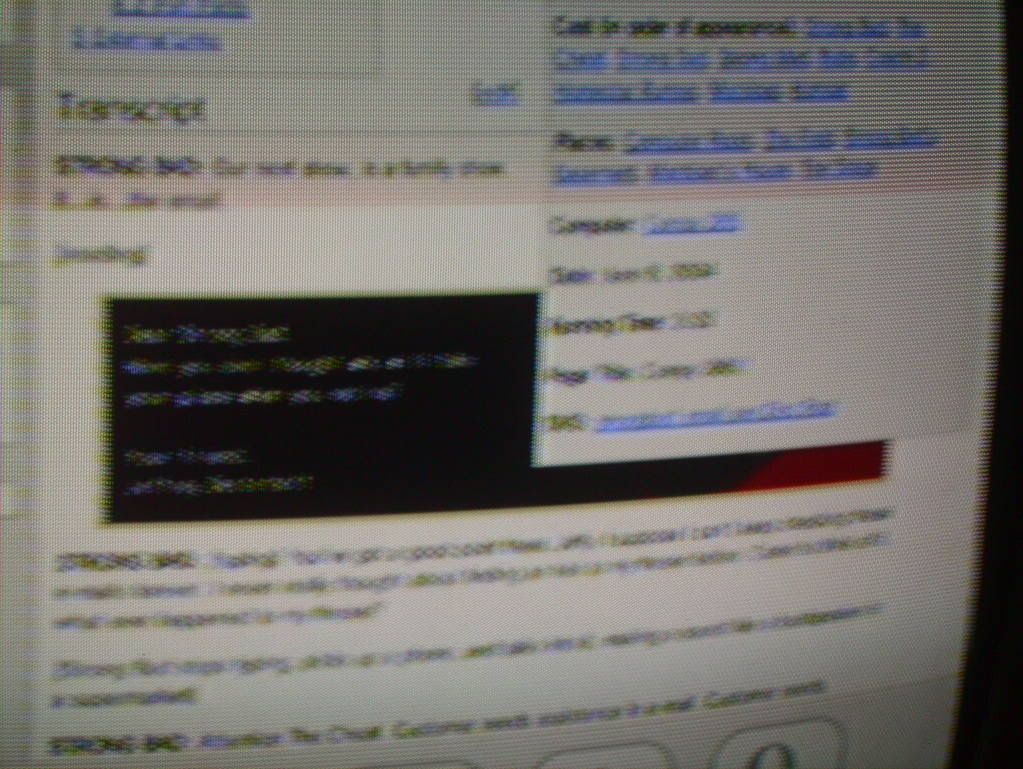
Here's a screenshot of this page as viewed in Opera 9 on a PC at 1024x768. Note the problematic overlap in the lower right corner. - Qermaq - (T/C) ![]() 23:51, 13 January 2007 (UTC)
23:51, 13 January 2007 (UTC)
- Also, here's a poor quality image of what it looks like using the Wii's Opera browser, which I think runs at a resolution of 640x400 (with the 80 being taken up by the Opera navbar). As you can see, it never overlaps the text, which is a good thing, even if it does overlap the transcript image. --
 ENUSY
ENUSY 

 00:06, 14 January 2007 (UTC)
