User talk:It's dot com/replacement
From Homestar Runner Wiki
Contents |
[edit] Infobox
Feel free to comment on this page. Or go ahead make it better yourself. Be sure to keep in mind that it has to look at least decent at a screen resolution of 800×600. — It's dot com 20:37, 13 January 2007 (UTC)
- Like the idea. Though at my 1024×768 resolution, it overlaps Strong Bad's head in the email blockquote. -- Tom 20:45, 13 January 2007 (UTC)
- Hmm. I use the same resolution, and the two never come anywhere near each other. (Although it could be a browser thing, I suppose.) Anyways, I quite like the idea. It don't look half bad. --DorianGray
- I like that box! It looks great in 1280×1240, too. Will we have "Short Toon", "Game" etc. at the top of the box if it's not a sbemail? Loafing
 20:51, 13 January 2007 (UTC)
- Hmm... I need it to
{{clear}}if it's going to collide with the transcript because of the resolution, but not do so if the screen is wide enough. Any ideas? — It's dot com 21:01, 13 January 2007 (UTC)
- Hmm... I need it to
- I like that box! It looks great in 1280×1240, too. Will we have "Short Toon", "Game" etc. at the top of the box if it's not a sbemail? Loafing
- Hmm. I use the same resolution, and the two never come anywhere near each other. (Although it could be a browser thing, I suppose.) Anyways, I quite like the idea. It don't look half bad. --DorianGray
- Issue is that if you clear, there's a huge gap as the inset is so tall. As the email blockquote is based on an image, it cannot flow around the floated inset. Perhaps the font size in the inset can be reduced, or elements rearranged, to allow it to be less tall. Alternately, or not, the email blockquote can be resized to take up less lateral width. Personally, I think given the constraints we are faced with, unless you can alter the email blockquote you're screwed. - Qermaq - (T/C)
 23:57, 13 January 2007 (UTC)
- Issue is that if you clear, there's a huge gap as the inset is so tall. As the email blockquote is based on an image, it cannot flow around the floated inset. Perhaps the font size in the inset can be reduced, or elements rearranged, to allow it to be less tall. Alternately, or not, the email blockquote can be resized to take up less lateral width. Personally, I think given the constraints we are faced with, unless you can alter the email blockquote you're screwed. - Qermaq - (T/C)
- I was able to fix it. How does it look now? — It's dot com 01:01, 14 January 2007 (UTC)
- It is guaranteed to succeed, but kinda ugly. The image is a kludge. Why not clear the "Transcript" element instead? (Edit: Or better yet, the div you added?) - Qermaq - (T/C) 01:04, 14 January 2007 (UTC)
- Because, as I said, clearing the transcript doesn't look correct on large resolutions, and not clearing it doesn't look correct on small resolutions. I need something to take up the approximate width of the blockquote so that it will prevent the infobox from overlying it, and the image does the job nicely. Also, that div is a separate issue and didn't have any effect anyway. — It's dot com 01:13, 14 January 2007 (UTC)
- The re-organizing and "widthening" of the float seems to have done the trick. - Qermaq - (T/C) 01:33, 14 January 2007 (UTC)
- I don't think that smaller fontsizes are the way to go. Even 'Kipedia says so! Loafing 01:37, 14 January 2007 (UTC)
- The font size currently is 90%, which seems easy enough to read to me. If we can keep the infobox the width it is now, then the page will look good really good at a screen resolution of 1024×768, which is probably what the average user uses. — It's dot com 02:09, 14 January 2007 (UTC)
- I don't think that smaller fontsizes are the way to go. Even 'Kipedia says so! Loafing
- The re-organizing and "widthening" of the float seems to have done the trick. - Qermaq - (T/C)
- Because, as I said, clearing the transcript doesn't look correct on large resolutions, and not clearing it doesn't look correct on small resolutions. I need something to take up the approximate width of the blockquote so that it will prevent the infobox from overlying it, and the image does the job nicely. Also, that div is a separate issue and didn't have any effect anyway. — It's dot com 01:13, 14 January 2007 (UTC)
- It is guaranteed to succeed, but kinda ugly. The image is a kludge. Why not clear the "Transcript" element instead? (Edit: Or better yet, the div you added?) - Qermaq - (T/C)
- I was able to fix it. How does it look now? — It's dot com 01:01, 14 January 2007 (UTC)
- I like how it's shaping up. One thing that still gets me is the complete absence of any article content (on the left there) before the transcript heading. Maybe keep the summary there? It seems a little out of place in its current position. I don't know though, moving to the left makes it look lonely... -- Tom 07:10, 14 January 2007 (UTC)
- It's a good idea, but it all seems a tad squished. Perhaps a bit more line-spacing and padding would make it a bit more visually appealing. Maybe like that band infobox template we have. — Lapper (talk) 07:19, 14 January 2007 (UTC)
- Well I like how it looks. I do, however, agree with things easy. But it would take a while to chane all the sbemails and toons to use that box. But I like helping out the wiki, so if you ever decide to change the toons, someone can tell me. Homestar-Winner (talk) 21:17, 7 June 2007 (UTC)
[edit] Transcript width
See the page with a narrow transcript width. The width of the transcript is something that has always bothered me, but it's a separate issue from the infobox. Basically, I made it much narrower because I think it's a lot easier to read that way. What do you think? — It's dot com 21:14, 13 January 2007 (UTC)
- Hates it. I much like it wide. I find it easier to read that way. The white space sears my eyeballs. --DorianGray
- {edit conflict}I don't like all the blank white space that comes as a result, even though I do kind of like the more compact look that comes with the narrower transcript. Heimstern Läufer
 21:32, 13 January 2007 (UTC)
- {edit conflict}I don't like all the blank white space that comes as a result, even though I do kind of like the more compact look that comes with the narrower transcript. Heimstern Läufer
[edit] Issue
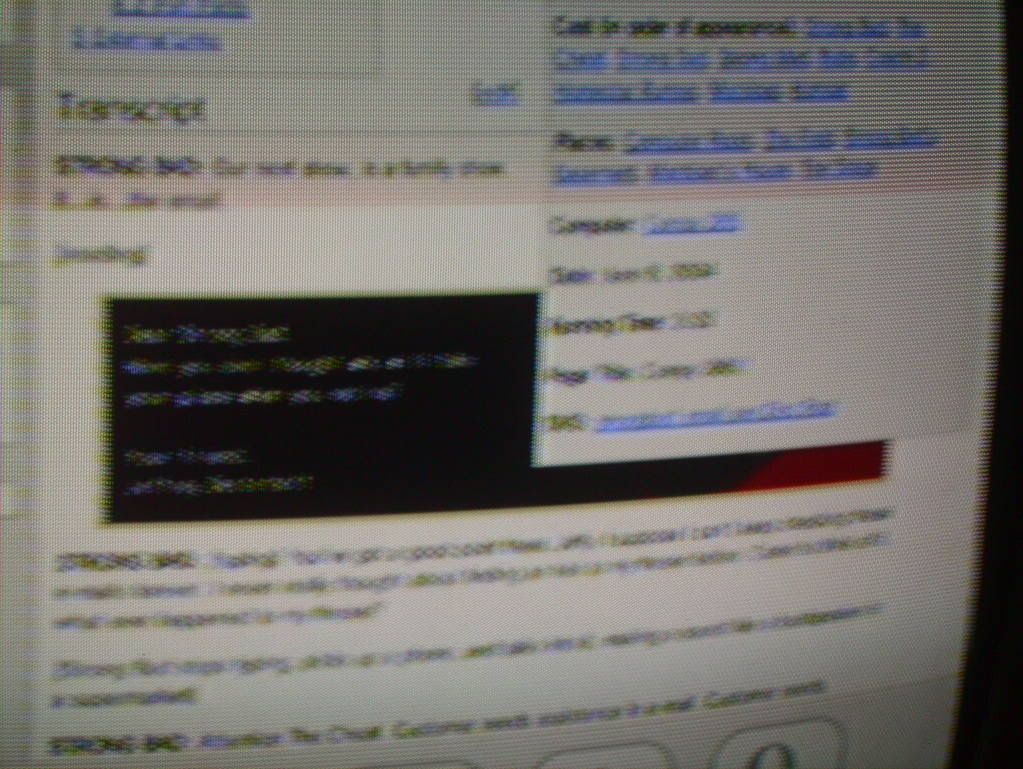
Here's a screenshot of this page as viewed in Opera 9 on a PC at 1024x768. Note the problematic overlap in the lower right corner. - Qermaq - (T/C) ![]() 23:51, 13 January 2007 (UTC)
23:51, 13 January 2007 (UTC)
- Also, here's a poor quality image of what it looks like using the Wii's Opera browser, which I think runs at a resolution of 640x400 (with the 80 being taken up by the Opera navbar). As you can see, it never overlaps the text, which is a good thing, even if it does overlap the transcript image. --
 ENUSY
ENUSY 

 00:06, 14 January 2007 (UTC)
- Right, any modern user agent will wrap the text properly. But images don't wrap, and that's the source of the problem. If we did not have an image so soon in the transcript this would work fine, but so long as we do it's going to inevitably lead to this type of thing. - Qermaq - (T/C) 00:30, 14 January 2007 (UTC)
- This issue is the one we are talking about in the first section, and it has now been fixed. — It's dot com 00:47, 14 January 2007 (UTC)
- Right, any modern user agent will wrap the text properly. But images don't wrap, and that's the source of the problem. If we did not have an image so soon in the transcript this would work fine, but so long as we do it's going to inevitably lead to this type of thing. - Qermaq - (T/C)
[edit] Meh
Does anyone besides me dislike the box compared to the old format? I liked the info being larger and stuff. - Joshua 14:35, 14 January 2007 (UTC)
- I don't like the idea too. It's like Wikipedia's long, drawn-out infoboxes that last forever and contain little info. The cast, places and such fit right in the beginning before it looks good, and have been since the wiki started. Adding new info is not difficult (see the new DVD info) and it acts as a good summary of the toon before the TOC without needing to scroll. I think the info box, even if it will look good after it's tweaked will only over complicate things. It also make the image smaller, and the cast difficult to browse through. — Elcool (talk)(contribs) 05:26, 15 January 2007 (UTC)
- Imagine how it'll look for the cast on a page like Teen Girl Squad Issue 10. --DorianGray
- True. Here is a list of things I see on the normal toon page and on the new page:
- Original page: Email number, next and previews email, summary, cast, places, computer, date, running time, title page, DVD info and half a TOC.
- New page: Email number, next and previews email, summary, cast, places, computer, TOC and the first line of the transcript.
- So instead of saving up space, it actually wastes it, because if I wanted to read the transcript I still had to scroll. But the toon's core info is missing. I think that rested my case. — Elcool (talk)(contribs) 05:36, 15 January 2007 (UTC)
- I agree with the above statement in Meh, I don't much like it either.
 I R F 06:01, 15 January 2007 (UTC)
- Having viewed it a few times, I conclude that the costs outweigh the benefits. As the potential overlap of the floated table with the blockquote is inevitable at some resolution without a kludgy fix, perhaps it's better the way it was. If it weren't for the image in the blockquote, which I think is pretty much a staple here, this could work, but as is, no. - Qermaq - (T/C) 06:23, 15 January 2007 (UTC)
- Having viewed it a few times, I conclude that the costs outweigh the benefits. As the potential overlap of the floated table with the blockquote is inevitable at some resolution without a kludgy fix, perhaps it's better the way it was. If it weren't for the image in the blockquote, which I think is pretty much a staple here, this could work, but as is, no. - Qermaq - (T/C)
- I agree with the above statement in Meh, I don't much like it either.
- Imagine how it'll look for the cast on a page like Teen Girl Squad Issue 10. --DorianGray
