Coach Z Evolution
From Homestar Runner Wiki
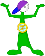
This page tracks the evolution of Coach Z. His design has remained largely consistent since his first appearance as Coach Zee, with most changes relating to the brightness of his colors and details of his medallion.
| Image | Remarks | Created | Appearances | What's Changed? |
|---|---|---|---|---|
| | Unknown, likely 1999 or earlier | Sketchbook (museum) | N/A | |
| | Named "Coach Zee" | 1999 | Where My Hat Is At?
flashback; alternate universe; The Homestar Runner Gets Something Stuck In His Craw; Homestar Runner Goes for the Gold | N/A |
| | Name simplified to "Coach Z" | December 1999 | Marshmallow's Last Stand; Old Characters Page | His colors are noticeably lighter and brighter, and he now is shaded. His head is rounder. The medallion is more detailed, gaining a gold border while the Z is more angular and similarly golden. |
| | 2000 | Character Cards; Dancin' Bubs; Yearbook Character Page (in photo) | Colors are overall darker — excepting the blue background of the medallion, which is brightened — and include gradients. The outline is thinner and cleaner; his eyes are now perfect circles. His hat has been recolored, swapping to purple cap and blue bill from the other way around. | |
| | 2000 | Theme Song Video; Homestarloween Party | Outlines are now colored. Coach Z's overall color scheme has been adjusted, with shades being brightened to various degrees and using flat colors rather than gradients. His head casts a light shadow on his neck. | |
| | This design is still used whenever he walks in his later designs (Note the design of the medallion and head changing). | 2000 | Toons from A Holiday Greeting to Date Nite; Main Pages 11 and 23; various Strong Bad Emails from stand-up to mini-golf | His body is a darker, less-saturated green; it is now shaded (with his neck shaded differently from the prior design), with the medallion casting a shadow on his body for the first time. The medallion has been adjusted to look more metallic, with additional shading and highlights; the blue backing now has a darker pattern resembling an inverted Z. His outlines are drawn thicker and brighter overall, varying in weight to give a more three-dimensional appearance. |
| Sixth design | After this design's debut, the fifth design was still used interchangeably through 2007. | 2003 | Various Strong Bad Emails starting with impression; various toons starting with 3 Times Halloween Funjob | His bowlegged stance is narrower. The medallion has been subtly redesigned and recolored, giving it a more golden appearance while the blue Z is no longer inverted, it is overall slightly darker without inner shading; it leaves a lighter shadow on his torso than before, blending in with the body's other shading. His cap is less slanted, and the brim is smaller. His head is larger, and his outlines no longer have gaps at his arms. |
| | This is the current design. | 2020 | Halloween Hijinks; parenting | His eyeline is tilted, now aligned with his cap. His head and hat are slightly smaller. |
| Character Evolutions |
|---|
| Homestar Runner · Strong Bad · Pom Pom · Coach Z · Bubs · The Cheat · Strong Mad · Strong Sad · Marzipan · The King of Town · The Poopsmith · Homsar |


