Homestar Runner Evolution
From Homestar Runner Wiki
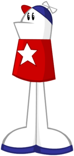
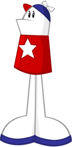
Homestar Runner has gone through the most design changes of all the characters in the Homestar Runner universe.
Originally referred to as "The Homestar Runner", he has since dropped the integral article and that name has been inherited by his Old-Timey counterpart.
| Image | Remarks | Created | Appearances | What's Changed? |
|---|---|---|---|---|
| | Proposed design for the Original Book. Drawn by Craig Zobel. | Summer 1996 | Instagram; @StrongBadActual | N/A |
| Called "The Homestar Runner" | July 1996 | Original Book; Super NES
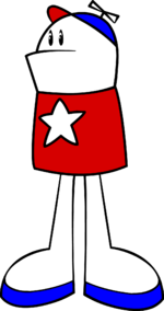
Strumstar Hammer; flashback; Main Page 20; Strongest Man in the World; The Homestar Runner Gets Something Stuck In His Craw; Halloween Safety (Easter egg); Homestar Runner Goes for the Gold; The Homestar Runner Enters The Spooky Woods | The rough design has been reworked and simplified, losing many details like hat panels and shirt seams. Homestar is more clearly not human, lacking arms and with an oversized head. He has a pronounced underbite, and his cap has a propeller but lacks a star. | |
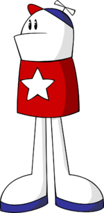
| | June 1999 | Where My Hat Is At?; Second Flash | His eyes, occasionally drawn as pie shapes, are now elongated into ovals. His mouth is smaller, with a more pointed and jutting "lower lip". His shirt is darker and no longer shown open at the bottom. His feet are a different shape, his hat and feet are brighter and his head is smaller.
Homestar is drawn at a more angular pose, looking to the side rather than forward. Adjustments to the art style also include thicker lines and new shading. | |
| | By this point, his name is simply "Homestar Runner". | November 1999 | Old loading screen; Marshmallow's Last Stand; Bronco Trolleys; Old Characters Page; Old Intro; She Loves Me!; Hairstyle Runner (head) | His shirt is a brighter color, his feet have changed shape again, his shading is in different places, his underbite doesn't jut out as much and his hat and shoes have shading. His mouth now tends to open in a rectangular or rounded shape as opposed to the wedge shape that was more common earlier. His head is rounder. Homestar is drawn with cleaner, solid lines that are less "sketchy". |
| | Early 2000 | Old Intro 2; Character Cards; Dancin' Bubs; The Reddest Radish; Yearbook Character Page (in photo) | His shirt is darker red and has a smaller star. His eyes have been redrawn, now featuring whites and a glint on the pupil. His proportions have been adjusted, giving him legs that are longer and closer together as well as a slightly taller overall height. Homestar is drawn with a more consistent line weight, lighter than the previous iteration; he is drawn in cleaner vector shapes than the previous hand-drawn feeling; he is no longer shaded. | |
| | April 2000 | A Jumping Jack Contest
virus; Main Page 22; No Hands On Deck!; Sbemailiarized; Hremail 7 | His star is slightly bigger and more symmetrical, his head is less squat, and his eyes are closer together. His shading is back, colors are overall darker and less saturated, and he has a thinner outline. | |
| | The Brothers Chaps nicknamed this design "Fat Body Homestar". | May 2000 | Theme Song Video; The Luau; Homestarloween Party; A Holiday Greeting; A Jorb Well Done (pre-May 2001); Main Pages 9 and 12; In Search of the Yello Dello Theatrical trailer; In Search of the Yello Dello Deleted Scene 2; Yearbook Character Page; Homestar Runner Screensaver; Why Come Only One Girl? | His outlines are colored. and his eyes now periodically flip depending on the direction he is looking. His head's and body's shading no longer match a consistent light source, staying on his back no matter the direction they are facing; the shading on his legs is now symmetrical. The back view of this design continued to be used for years even after the introduction of later designs, from A Jorb Well Done to as late as Malloween Commercial. |
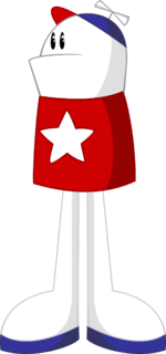
| | This is the beginning of his "modern" look. | February 2001 | A Jorb Well Done; Fluffy Puff Commercial; Sing Along; Tis True, Pom Pom, Tis True; halloweener; Some Stupid Turkey; The House That Gave Sucky Treats; The Best Decemberween Ever; Where's The Cheat?; First Time Here?; The Interview; Old New Intro; Old Everybody Intro | Homestar is overall taller, thinner, and more angular. His shirt is brighter with an asymmetrical star. He now stands with his feet together. His propeller is bigger, and his underbite is not as curved and juts out further. His outlines are much thicker yet colored lighter; the shading on his legs is asymmetrical again. In one scene of A Jorb Well Done, his legs utilize an older design but the rest of his body is the current one. |
| | This design is used interchangeably with the prior design, sometimes within the same toon. | May 2001 | halloweener, Where's The Cheat? | The color of Homestar's shirt and of his hat's bill is a deeper red rather than a brighter maroon. In halloweener, some outlines are thinner and his star is slightly more rounded. |
| | April 2002 | All Main Pages except 9, 10, 12, 13, 15, 17, 20, 21, 25, and 26; toons from Meet Marshie to I Killed Pom Pom; First Time Here?; various Strong Bad Emails starting with the bird; Marzipan Answering Machine Versions 9.2, 13.2, and 14.2 | His outline is thicker and darker, and the star on his shirt is more angular and less puffy. His mouth has gone back slightly and is more level. His head is stationary when he talks. His eyes are slightly higher. His shirt has more shading and his legs have less (they are symmetrically shaded again). His legs are slightly shorter and his feet are smaller; he stands level rather than angled. His shirt is darker, and it gains a highlight in addition to its shading. Starting with Coach Z's 110%, Homestar has a new mouth position for when closing his mouth. There were minor variations in the design across its appearances, often incorporating elements of previous versions: sometimes his colors would be brighter; other times his shirt would be that of the previous version; in time capsule, dreamail, and modeling, his eyes are closer together; in Main Pages before 15 and in The Best Decemberween Ever, his head outline and mouth are shaped like the previous version. | |
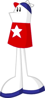
| | This is the current design. | February 2007 | All toons and emails beginning with unnatural | Homestar's feet are larger and his legs are slightly longer. His mouth is now bent into a very subtle frown, although it does sometimes change back to the previous design. Overall shading is lighter, with some additional shading in the brim of his hat, and his outlines are slightly thinner. Starting with too cool, he has gained a new facial expression indicating curiosity or confusion. |
[edit] See Also
| Character Evolutions |
|---|
| Homestar Runner · Strong Bad · Pom Pom · Coach Z · Bubs · The Cheat · Strong Mad · Strong Sad · Marzipan · The King of Town · The Poopsmith · Homsar |


