Strong Bad Evolution
From Homestar Runner Wiki
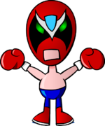
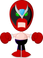
Strong Bad has had his share of visual changes, much like Homestar Runner. His mask design has become more stylized with the addition of a blue diamond and a silver V on his forehead.
His accent and personality have significantly changed over the years as well, developing from a one-off rival to the deuteragonist of the Homestar Runner body of work, likely due to his recurring Strong Bad Email segment.
| Image | Remarks | Created | Appearances | What's Changed? |
|---|---|---|---|---|
| | Proposed design for the Original Book. Drawn by Craig Zobel. | Summer 1996 | @StrongBadActual (Instagram, Twitter) | N/A |
| First design | This design would be later referred to as "Tiny-Handed Strong Bad". | July 1996 | Original Book; Super NES
Strumstar Hammer; flashback; Main Page 20; alternate universe; The Homestar Runner Gets Something Stuck In His Craw; Halloween Safety (Easter egg); @StrongBadActual; Homestar Runner Goes for the Gold | Rather than using the lizard design, Strong Bad's first iteration was based on the Strong Bads team from Tag Team Wrestling. He resembles a luchador, with wrestling pants and boxing gloves. His clothes are all red, and his mask has a simple black design with a pointed nose shape. His eyes and mouth are simple, solid white. In some appearances, he is drawn with a belly button. |
| | 1999 | Marshmallow's Last Stand; Old Characters Page | Strong Bad's skin tone is now more pink than tan, and his mouth is flesh-colored rather than white. His eyes are a gradient green with a more angular shape. His mask design is much more detailed, gaining a silver crest over his brows that extends to the nose and a blue diamond on the forehead; the red of his mask can be seen around his eyes, giving them a set-in appearance. His pants are now blue or black and his belly button is seen more consistently. His proportions have been adjusted, with longer limbs and a smaller head to give him a taller appearance. Strong Bad is drawn facing forward rather than angled to the side, outlines are thicker, and he has limited shading. | |
| | 2000 | Character Cards; The Reddest Radish | His eyes are again flush with the black portion of his mask, making it look more like a face and less like something worn over his head. His pants are a brighter blue and he now wears red shoes with white soles. He no longer has a belly button. Overall, colors are brighter; some sections are colored with gradients and a few highlights are added to offset shading. | |
| | This is the beginning of his "modern" look. | 2000 | A Jumping Jack Contest; Strong Libs; Yearbook Character Page (in picture), Email Processing Room (silhouette) | His design is reworked with a cleaner vector look rather than the hand-drawn feeling of earlier iterations. Lines are thinner, shading is darker and there are no longer gradients (excepting his eyes) or highlights. His shades of red are slightly darker. Strong Bad now consistently wears black pants, and his shoes are bigger and are a different shape. His boxing gloves are bigger, while his arms are shorter and wider. He stands with his legs closer together. His mouth's shape is a more defined frown, now symmetrical. His eyes are circular. The black and silver elements of his mask's pattern now have sharper, more defined curves. |
| | 2000 | Strong Bad Sings; Yearbook Character Page; Theme Song Video; Homestarloween Party; A Holiday Greeting; A Jorb Well Done; The Luau; Tis True, Pom Pom, Tis True; all Strong Bad Emails from some kinda robot to halloweener; Main Pages 6, 7, 8 and 11; The House That Gave Sucky Treats; Some Stupid Turkey; "Post January 2003-2004 Compy 386 Scroll Button Songs" (remainder shading), 2001-January 2003 Tandy 400-Compy 386 Scroll Button Songs (except for the broken Tandy menu) | His colors are overall brighter, emphasized by outlines that are much narrower and colored. The tops of his boots are now slanted, and the boots have additional shading. His eyes, and by extension the crest of his mask, have been moved down a little. In Strong Bad Emails with this design, he also had some elements of his sixth design.
Around this point, Strong Bad's role transitions from purely antagonistic to more of a humorously sarcastic rogue. His voice is noticeably losing its accent and shifting to its current sound. His mouth has a very thin outline in this version. | |
| | 2001 | A Mother's Day Message; The Best Decemberween Ever; all Strong Bad Emails from brianrietta to extra plug (except anything); garage sale; 4 branches; The Cheat Theme Song; Where's The Cheat?; First Time Here?; Everybody to the Limit; Main Page 15; Homestar Talker; Pumpkin Carve-nival; A Decemberween Pageant; Decemberween Email Menu; The System is Down; Superbowl Dealie; Arcade Game; Revenge of the King; Lookin at a Thing in a Bag; Malloween Commercial; 3 Times Halloween Funjob; Sbemail 100 Fakeout; Strong Bad is in Jail Cartoon; New Boots; Cheat Commandos; Decemberween Sweet Cuppin' Cakes; Experimental Film; Halloween Fairstival; Post January 2003-2004 Compy 386 Scroll Button Songs | His design now features highlights - on portions of his mask, circular spots on his eyes and torso, purple highlights on his pants, and window-pane reflections on his gloves. The black in his mask is now a dark gray. His mouth now has an inset shadow. Outlines now vary greatly in width, thicker in shaded portions and narrower near highlights, to add dimensionality. His proportions have been adjusted - larger head and gloves, closer-together legs, and longer arms.
By now, the accent has more or less gone away; it has evolved into a much more relaxed voice that has more variation in tone and delivery, unlike the more forced low tone of his earlier speech. | |
| Seventh design | 2004 | All Strong Bad Emails from montage to candy product; redesign; Main Pages 22 and 23; Homestar Presents: Presents; HomestarRunner.com: PAY PLUS!; The Li'l Brudder Show; Bug In Mouth Disease; Store Thank You Messages; Senorial Day; Happy Fireworks; Cool Things; Trogdor Con '97; Sick Day; Teen Girl Squad Issue 10; Strong Bad is a Bad Guy; Halloween Potion-ma-jig; Fall Float Parade; Happy Trogday; Career Day | His head is bigger, and the black portion of his mask is slightly darker and takes up more space; the diamond and V-shape are also more symmetrical to each other, though some toons and even a few emails retain the previous version's V-shape. His arms are higher up and shorter. His shoes are darker, a different shape (also flat at the top where they meet his pants) and have different shading. His pants have lost some of their purple shading. The shading on Strong Bad's boots and pants seems to drift from this version's style to the previous version and back.
In sbemails, his head tilts less as it bobs up and down. Around this point, Strong Bad's voice is even less monotone, expressing a much wider vocal range. | |
| | This is the current design. | 2006 | Various toons from Sbemail 150?!? to current; all Strong Bad Emails starting with alternate universe; Main Page 24; 4 Gregs | Strong Bad's head is slightly smaller, closer to his sixth design. His eyes are closer together, showing more of their rounded shape and making his face appear less flat. The V-crest's shape has been slightly adjusted; the black part of his mask is darker, bigger, and has less prominent shading; the shadows on the diamond are smaller. The purple shading on his pants still varies from toon to toon, and in some cases it appears gray. In some toons from I Killed Pom Pom onward, Strong Bad's mouth is more symmetrical. |


